
Happy Saturday, everyone! Today on my how to series, I’m talking about how to make your blog look nice!
Quick disclaimer: I’m not trying to say that I’m an expert or the best at this, by any means. These are honestly just things I’ve found work for me, and that I wanted to know when I started my blog. I’m definitely not an expert at graphic design, either, so if you want tips on that, this is not the post for you, unfortunately.
I know some people who have such lovely themes and graphics, but alas, I am not one of them. However, there are super easy ways to make your blog and blog posts still look nice. Your aesthetic doesn’t need to be super complicated or fancy. I just use free florals and straight pink lines. But, it makes your blog look more cohesive (imo).

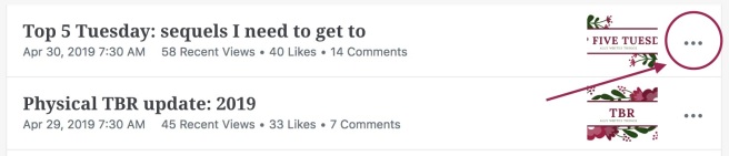
General tip: you can copy posts! I find this super helpful for posts I do frequently with links (like T5W or T5T) because the links are already there, as well as the categories and tags you put. It’s also useful for keeping the format of your posts consistent.
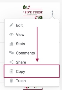
To do this, you click on the three dots next to a published or unpublished post of yours and select “copy”.
Have a featured image
A featured image is the image you see on the WordPress reader or on your blog. If you don’t have a feature image, WordPress randomly chooses one from the post (usually the first one). Personally, when I’m blog hopping, I’m more likely to read someone’s post if they have some sort of featured image.
Make sure you check your featured images and headers to make sure they’re not blurry! Generally, the dimensions WordPress gives are vvv small. They give the dimensions in pixels, which doesn’t work when blown up. Often, the headers look fine on a mobile device, but on a laptop or computer, they look super blurry. For my blog header, I think I did 4x what WordPress said, and it was still blurry. So just play around with the dimensions until it’s not blurry.
Put the book covers in your post
Doing this breaks up big blocks of text and makes posts easier to read. It’s also useful for people skimming your post: if they see a cover they know or like, they’re more likely to read what you have to say about it.
- Time management tip: putting the covers individually takes time, though. So instead, at the very least, bold the title and author of the book.
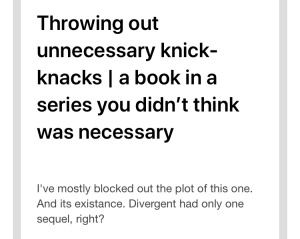
That being said, if someone has bad wifi or connection, or their phone doesn’t automatically download pictures, they won’t see what book you’re talking about. So make sure you also put the name of the book below the cover. There are so many times I’m reading posts on my phone, and I don’t know what book people are talking about because they only put the cover and don’t mention the book below.


These two bloggers have the titles in the blog post, so it’s easy to know what books they’re talking about even when the pictures don’t load.
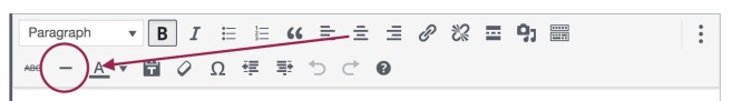
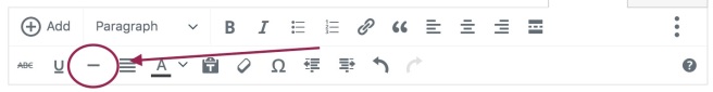
Use the vertical line feature!!
It’s honestly so useful!! Use it to break up sections of your posts, like the intro, or different points! Again, this makes it easier to read and breaks up massive chunks of text.
At the very least, use multiple, shorter paragraphs. This makes the post easier for the reader to read. Also bold the parts you want people to read!
Canva is your new best friend
You can use Canva to make graphics, headers, icons, collages. Whatever you need, really. And it’s free!! There are some graphics you have to pay for, but either (a) they’re very cheap or (b) you don’t have to use them and can normally find a good dupe. Canva is what I use to make all my featured images, headers, and the pink lines in the posts. For most of the free graphics, you can edit the colours to fit your ~*~aesthetic~*~
Speaking of which: have a colour scheme!!
Tbh, the hardest thing for me was choosing a colour scheme and sticking to it. I switched my colour scheme every couple of months for a while, and have been settled on pink for a while (but I also want to change it to make it purple or blue so that might happen at some point). Your colour scheme can be whatever you want, but try to make it consistent throughout your blog.
At the end of the day, it’s your blog. Do you what you want and what you think looks good. I know some people who put minimal effort into the appearance of their blog, and they’re still some of my favourites because they have great content and are great to talk to. Appearances definitely aren’t everything.
Here are some other bloggers’ posts on blog design, if you want to read more!
- May has a great post with lots of good beginner tips and links to websites to get pictures!
- Vicky has a post on how to make book covers into horizontal headers, which is so useful and makes your headers look so professional.
But those are some of my tips for how to make your blog look nice! What are yours? Do you have any I should try? Let me know!
If there’s anything you want me to cover, let me know and I can do my best!
Thanks for reading! xx


Good tips! I really congratulate everyone who’s got a throughout design, probably going to work on that a bit myself this summer, haha.
LikeLiked by 1 person
Thank you! ❤ and SAME I feel like mine is getting there but then I look at some other people's and I'm like jk
LikeLiked by 1 person
This is so helpful!! I had no idea you could copy posts, that’s going to save me a hell of a lot of time😂
LikeLiked by 1 person
Yay I’m so glad it was useful! And YES copying posts saves SO MUCH TIME! It’s the best!
LikeLiked by 1 person
Agree completely with all these tips!! Loved this post xx
LikeLiked by 1 person
Thank you so much! ❤
LikeLiked by 1 person
Love this post!! Canva is the absolute best. Also, had no idea that that button made a horizontal line–not quite sure what I thought it did, but WOW that is a game changer!!
LikeLiked by 1 person
Thank you! ❤
Canva is so great!! I even used it to make business cards for my work lol. And yes, the horizontal line is a game changer! I'm so glad this post was useful 🙂
LikeLiked by 1 person
Great post! I do most of these things but the Copy thing is new to me and it will definitely be super helpful!!! Thanks a milion ❤
LikeLiked by 1 person
Thank you!! ❤
I'm so glad it was helpful! Copying posts is literally the best
LikeLiked by 1 person
Welcome! I just tried it and it made my life so much easier! Thanks a million, that was beyond awesome!
LikeLiked by 1 person
Great tips, I love the horizontal line more than should be legal myself hehe
LikeLiked by 1 person
SAME it’s so useful!
Thank you, Kal! ❤
LikeLike
Reblogged this on LIFE STORIES FROM LINCOLN.
LikeLiked by 1 person
Thank you so much for reblogging this! ❤
LikeLiked by 1 person
This is SO helpful, thank you for sharing your knowledge with us!!!
LikeLiked by 1 person
Yay I’m so happy it was helpful! ❤ Thank you for reading!
LikeLike
Nice tips! I love the “copy post” option on WP. I have a series of draft posts that I copy each time I need a new one and it’s all ready to go.
LikeLiked by 1 person
Thank you! And same!! It’s so useful and such a time-saver!
LikeLike
Great tip about the color scheme. Honestly it’s indeed ~*~aesthetics~*~ when a blog has a similar appealing color scheme 😅
LikeLiked by 1 person
Thank you, Ayunda! 💖
I know! I love when blogs are colour-coordinated lol
LikeLiked by 1 person
You are completely right about Canva! I can’t make images without it!
LikeLiked by 1 person
Right, it’s the best!
LikeLiked by 1 person
Oh my goodness, the ‘copy post’ feature is going to change my life! What a tip! Thank you 😁
LikeLiked by 1 person
Right, it’s a total game changer! You’re very welcome!
LikeLiked by 1 person
Hi💛 Just letting you know that you are so talented and you inspired me to make my blog💗 I’m new on this and your blog really helped me💚 Have a great day
LikeLiked by 1 person
Thank you so much, Izzy 💕💕 I’m so glad this was useful! Have a great day, too!
LikeLike